บทนำ CSS
CSS (Cascading Style Sheets) เป็นภาษาที่ใช้สำหรับจัดรูปแบบและออกแบบเว็บเพจ CSS ทำให้เราสามารถควบคุมสี, ขนาด, spacing, positioning และ animation ได้ รวมกับ HTML (โครงสร้าง) และ JavaScript (interactivity) ทำให้เว็บไซต์สมบูรณ์
ความสำคัญของ CSS
CSS เป็นพื้นฐานที่สำคัญในการพัฒนาเว็บ เนื่องจาก:
- แยก Content และ Presentation - HTML เก็บเนื้อหา CSS เก็บรูปแบบ ทำให้โค้ดชัดเจนและง่ายบำรุงรักษา
- Responsive Design - สามารถสร้างเว็บไซต์ที่ทำงานได้บนอุปกรณ์ทุกขนาด
- ประหยัดเวลา - นำ CSS ไปใช้ซ้ำได้หลายครั้งในเอกสาร
- SEO Friendly - เว็บไซต์ที่ออกแบบดีด้วย CSS ได้ ranking ที่ดีในการค้นหา
- Performance - โค้ด CSS ที่ดีช่วยให้เว็บโหลดได้เร็วขึ้น
CSS คืออะไร
CSS ย่อมาจาก "Cascading Style Sheets" และมีบทบาทสำคัญในการออกแบบเว็บ ให้เราลงลึกเข้าไปเรียนรู้รายละเอียด
ความหมาย
CSS ย่อมาจาก Cascading Style Sheets
- Cascading = การไหลแบบชั้น ๆ ซึ่งหมายความว่า rule ต่อมาจะทับบน rule ก่อนหน้าถ้ามี selector เดียวกัน ยิ่งเข้าไปในลึก priority ยิ่งสูง
- Style = รูปแบบ, การจัดรูป ของการแสดงผล
- Sheets = หนังสือ, เอกสาร ที่บรรจุกฎเกณฑ์
Web Design Holy Trinity (สามเหลี่ยมทองของเว็บ)
เว็บไซต์สมบูรณ์ต้องประกอบไปด้วยสามส่วนสำคัญ:
| Technology | บทบาท | ตัวอย่าง |
|---|---|---|
| HTML | โครงสร้าง (Structure) | แท็ก <p>, <div>, <button> |
| CSS | รูปแบบ (Styling) | สี, ขนาด, spacing, layout |
| JavaScript | ปฏิสัมพันธ์ (Interaction) | Click, Hover, Animation events |
CSS ใช้สำหรับอะไร
- ✅ จัดสี (colors) - สีตัวอักษร พื้นหลัง และกรอบ
- ✅ ขนาดตัวอักษร (font sizes) - ขนาด ชนิด น้ำหนัก ของฟอนต์
- ✅ ระยะห่าง (spacing, margins, padding) - ระยะห่างในและนอก element
- ✅ การจัด layout - positioning, flexbox, grid สำหรับจัด element ในหน้า
- ✅ Animation และ transitions - สร้างการเคลื่อนไหว และผลเพิ่มเติม
- ✅ Responsive design - ทำให้เว็บสามารถปรับตัวได้ตามขนาดหน้าจอ
- ✅ Effects - เงา, gradient, filter, transform และอื่นๆ
วิธีใช้ CSS
มีสามวิธีในการเขียน CSS ในเว็บเพจ แต่ละวิธีมีข้อดีและข้อเสีย ลองเรียนรู้ความแตกต่างกัน
1. Inline CSS
เขียน CSS โดยตรงในแท็ก HTML ผ่านทาง style attribute:
<p style="color: red; font-size: 18px;">ข้อความสีแดง</p>
<button style="background-color: blue; color: white; padding: 10px 20px;">
  ปุ่มสีน้ำเงิน
</button>- ยากต่อการบำรุงรักษา - ต้องแก้ไขทีละ element
- ไม่สามารถ reuse ได้ - ต้องเขียนซ้ำทุกครั้ง
- ไม่สามารถใช้ advanced features เช่น media queries
- ทำให้ HTML ยุ่มเหยิง ยากต่อการอ่าน
- ต้องการเปลี่ยนรูปแบบเพียงครั้งเดียว
- ทดลอง style ในขั้นพัฒนา
- ใช้เป็นการชั่วคราว
2. Internal CSS
เขียน CSS ในแท็ก <style> ภายใน <head> ของ HTML:
<head>
  <style>
    /* กำหนด CSS ที่นี่ */
    p {
      color: red;
      font-size: 18px;
      line-height: 1.6;
    }

    button {
      background-color: blue;
      color: white;
      padding: 10px 20px;
    }
  </style>
</head>- CSS จะอยู่ในเอกสารเดียว
- สามารถจัด selector ได้ดีกว่า Inline
- สามารถใช้ advanced features ได้
- ไม่สามารถแชร์ CSS ระหว่างไฟล์ต่างๆ ได้
- ทำให้ไฟล์ HTML โตขึ้น ซึ่งส่งผลต่อความเร็วในการโหลด
3. External CSS (แนะนำ) ⭐
เขียน CSS ในไฟล์แยกต่างหาก และนำเข้าไปในแท็ก <head>:
<!-- ในไฟล์ HTML -->
<head>
  <link rel="stylesheet" href="style.css" />
</head>

<!-- ในไฟล์ style.css -->
p {
  color: red;
  font-size: 18px;
}

button {
  background-color: blue;
  color: white;
}- ทำให้ HTML สะอาด และง่ายต่อการอ่าน
- สามารถแชร์ CSS ระหว่างไฟล์ได้ (reusable)
- ปรับปรุง Performance - Browser สามารถแคชไฟล์ CSS ได้
- ง่ายต่อการบำรุงรักษา - แก้ไขในที่เดียว ใช้ทั่วไฟล์
- สามารถจัดระเบียบ code ได้ดี
- หลีกเลี่ยง Selector Conflicts ด้วยการใช้ Namespace หรือ SMACSS
CSS Selectors
Selectors ใช้เพื่อเลือก HTML elements ที่ต้องการจะจัดรูปแบบ มีหลายประเภทให้เลือกตามความเหมาะสม
1. Universal Selector (*)
เลือก ทุก element ในหน้า มักใช้ในการ reset margin และ padding:
* {
  margin: 0;
  padding: 0;
  box-sizing: border-box;
}
2. Element Selector
เลือก element โดยใช้ชื่อแท็ก HTML เช่น p, div, h1:
p {
  color: blue;
  font-size: 16px;
}

h1 {
  font-size: 32px;
  color: #333;
}
3. Class Selector (.)
เลือก element ที่มี class attribute ที่ตรงกัน (สามารถใช้หลายครั้งได้):
.intro {
  background-color: yellow;
  padding: 10px;
  border-radius: 5px;
}

.highlight {
  background-color: red;
  color: white;
}
ใช้ในไฟล์ HTML:
<p class="intro">นี่คือ intro</p>
<p class="intro highlight">นี่คือ intro ที่ highlight</p>
4. ID Selector (#)
เลือก element ที่มี id attribute ที่ตรงกัน (ควรใช้เพียง ครั้งเดียว ต่อหน้า):
#main-title {
  color: red;
  text-align: center;
  font-size: 40px;
}
ใช้ในไฟล์ HTML:
<h1 id="main-title">ชื่อเพจหลัก</h1>5. Attribute Selector ([])
เลือก element ตามค่าของ attribute:
/* เลือก input ที่มี type="text" */
input[type="text"] {
  border: 1px solid blue;
  padding: 5px;
}

/* เลือก link ที่ target="_blank" */
a[target="_blank"] {
  color: green;
  text-decoration: underline;
}

/* เลือก input ที่มี disabled attribute */
input[disabled] {
  background-color: #ccc;
  cursor: not-allowed;
}
6. Pseudo-class Selector (:)
เลือก element ในสถานะเฉพาะ เช่น hover, focus, active:
/* เมื่อชี้เม้าส์ที่ link */
a:hover {
  color: red;
  text-decoration: underline;
}

/* เมื่อปุ่มถูกกด */
button:active {
  transform: scale(0.95);
  background-color: darkblue;
}

/* เมื่อ input ได้รับ focus (ถูกคลิก) */
input:focus {
  outline: 2px solid blue;
  border-color: blue;
}

/* สถานะอื่นๆ */
a:visited { color: purple; }     /* link ที่เคยคลิกแล้ว */
li:first-child { margin-top: 0; } /* item แรก */
li:last-child { margin-bottom: 0; } /* item สุดท้าย */Selector ที่เฉพาะเจาะจงมากขึ้นจะมี priority สูงกว่า:
- Universal (*) - ต่ำที่สุด
- Element selector (p, div)
- Class selector (.intro)
- ID selector (#main)
- Inline style - สูงที่สุด
CSS Properties
CSS Properties คือคุณสมบัติที่ใช้กำหนดรูปแบบการแสดงผลของ element เช่น สี, ขนาด, ตำแหน่ง ฯลฯ
Syntax
โครงสร้างพื้นฐานของการเขียน CSS:
selector {
  property: value;
  property: value;
}
Commonly Used Properties
- width / height - กำหนดความกว้างและความสูง
- margin / padding - ระยะห่างด้านนอก/ด้านใน
- color - สีตัวอักษร
- background-color - สีพื้นหลัง
- border - กรอบ
- font-size / font-family - ขนาดและชนิดตัวอักษร
- text-align - จัดแนวข้อความ
- display - ลักษณะการแสดงผล
CSS Units
CSS Units เป็นหน่วยวัดที่ใช้ในการกำหนดขนาด, ระยะห่าง และค่าต่าง ๆ ใน CSS ปี ความเข้าใจหน่วยวัดนี้มีความสำคัญต่อการออกแบบ responsive design
ประเภทของ CSS Units
CSS Units แบ่งออกเป็น 3 กลุ่มหลัก:
- Absolute Units - ขนาดคงที่ไม่เปลี่ยนแปลง
- Relative Units - ขนาดสัมพันธ์กับค่าอื่น ๆ (flexible)
- Viewport Units - ขนาดสัมพันธ์กับขนาด browser window
1. Absolute Units (หน่วยสัมบูรณ์)
หน่วยที่มีขนาดคงที่ไม่เปลี่ยนแปลง ไม่ recommended สำหรับ responsive design:
| Unit | คำอธิบาย | ตัวอย่าง | Use Case |
|---|---|---|---|
| px (pixels) | พิกเซล (หน่วยย่อยของหน้าจอ) | width: 300px; | กำหนดขนาดที่แน่นอน, borders, บางทีเท่านั้น |
| cm (centimeters) | เซนติเมตร (ใช้ยาก) | width: 10cm; | บ่อยครั้งมากจาก media ออกแบบสำหรับการพิมพ์ |
| mm (millimeters) | มิลลิเมตร | width: 100mm; | ใช้สำหรับการพิมพ์ |
| in (inches) | นิ้ว | width: 2in; | ใช้สำหรับการพิมพ์ |
| pt (points) | จุด (1pt = 1/72 นิ้ว) | font-size: 12pt; | สำหรับการพิมพ์ documents |
ไม่ควรใช้ absolute units สำหรับขนาด layout ที่ต้อง responsive เนื่องจาก:
- ไม่เปลี่ยนแปลงตามขนาด browser หรือ device
- ทำให้เว็บไซต์ดูแปลก ๆ บนมือถือ
- ยากต่อการปรับให้เข้ากับอุปกรณ์ต่าง ๆ
ลองใช้ px เฉพาะจำนวนพอเพียง
2. Relative Units (หน่วยสัมพันธ์)
หน่วยที่มีขนาดขึ้นอยู่กับค่าอื่น ๆ อันดับแนนะนำสำหรับ responsive design:
| Unit | Reference | ตัวอย่าง | Responsive |
|---|---|---|---|
| % (percentage) | ขนาดของ parent element | width: 50%; | ✅ ดีมาก |
| em | font-size ของ element นั้น เอง (หรือ parent ถ้าใช้ใน font-size) | width: 2em; (2 เท่าของ font-size) | ✅ ดี |
| rem (root em) | font-size ของ root element (html) | width: 2rem; (2 เท่าของ root font-size) | ✅ ดีมาก (แนะนำ) |
| ch | ความกว้างของตัวอักษร "0" | width: 50ch; (50 ตัวอักษร) | ✅ สำหรับ text |
Percentage (%)
เป็นเปอร์เซ็นต์ของ parent element:
/* HTML */
<div class="container">
  <div class="child">Content</div>
</div>

/* CSS */
.container {
  width: 800px;
  height: 200px;
  background-color: #ddd;
}

.child {
  width: 50%;      /* 50% ของ 800px = 400px */
  height: 100%;    /* 100% ของ 200px = 200px */
  background-color: #0066cc;
}
Em Unit
Em = ขนาดสัมพันธ์กับ font-size ของ element นั้นเอง (หรือ parent เมื่อใช้ใน font-size):
/* ตัวอย่าง: em ใน width */
.box {
  font-size: 16px;
  width: 2em;      /* 2 x 16px = 32px */
  padding: 1.5em;  /* 1.5 x 16px = 24px */
}

/* ตัวอย่าง: em ใน font-size (ดูประวัติ) */
body {
  font-size: 16px;  /* base size */
}

body p {
  font-size: 1em;   /* 1 x 16px = 16px (inherit จาก body) */
}

body h1 {
  font-size: 2em;   /* 2 x 16px = 32px */
}

body h2 {
  font-size: 1.5em; /* 1.5 x 16px = 24px */
}

/* ⚠️ ปัญหา: Nesting ใน em */
.outer {
  font-size: 20px;
}

.outer .middle {
  font-size: 1.5em;  /* 1.5 x 20px = 30px */
}

.outer .middle .inner {
  font-size: 1.5em;  /* 1.5 x 30px = 45px ❌ ใหญ่เกิน! */
}
Rem Unit (Root Em) - ⭐ Recommended
Rem = ขนาดสัมพันธ์กับ font-size ของ root element (html) เท่านั้น ง่ายหลายค่านัยมากกว่า em:
/* HTML */
html {
  font-size: 16px;  /* root size */
}

/* CSS */
body {
  font-size: 1rem;  /* 1 x 16px = 16px */
}

h1 {
  font-size: 2rem;  /* 2 x 16px = 32px */
}

h2 {
  font-size: 1.5rem; /* 1.5 x 16px = 24px */
}

p {
  font-size: 1rem;
  margin-bottom: 1rem;
  padding: 0.5rem;
}

.btn {
  font-size: 0.875rem;  /* 0.875 x 16px = 14px */
  padding: 0.5rem 1rem;
  margin: 1rem 0;
}

/* ✅ ข้อดี Rem:
 * - Consistent ตลอดทั้ง document
 * - ไม่มีปัญหา nesting เหมือน em
 * - ง่ายต่อการปรับ global font-size
 */
Practical Example: Em vs Rem
/* Em Example - ปัญหา Nesting */
.card {
  font-size: 16px;
}

.card-title {
  font-size: 1.5em;  /* 16 x 1.5 = 24px ✅ */
}

.card .nested {
  font-size: 1.5em;  /* 24 x 1.5 = 36px ❌ ใหญ่เกิน! */
}

/* Rem Example - Consistent */
html {
  font-size: 16px;
}

.card {
  font-size: 1rem;  /* 16px */
}

.card-title {
  font-size: 1.5rem;  /* 24px ✅ */
}

.card .nested {
  font-size: 1.5rem;  /* 24px ✅ สอดคล้องกับข้างบน */
}
3. Viewport Units (หน่วยมุมมอง)
ขนาดสัมพันธ์กับขนาด browser window (viewport):
| Unit | คำอธิบาย | ตัวอย่าง | Use Case |
|---|---|---|---|
| vw (viewport width) | 1% ของความกว้าง browser | width: 50vw; (ครึ่งหนึ่งของ window) | Full-width sections, responsive fonts |
| vh (viewport height) | 1% ของความสูง browser | height: 100vh; (เต็มหน้าจอ) | Hero sections, full-page layouts |
| vmin | 1% ของค่าที่เล็กกว่า (width หรือ height) | font-size: 5vmin; | Responsive font ที่สมดุล |
| vmax | 1% ของค่าที่ใหญ่กว่า (width หรือ height) | font-size: 5vmax; | ใช้น้อย |
/* Full-screen Hero Section */
.hero {
  height: 100vh;           /* เต็มหน้าจอ */
  width: 100vw;            /* เต็มความกว้าง */
  display: flex;
  align-items: center;
  justify-content: center;
  background: linear-gradient(to right, #667eea 0%, #764ba2 100%);
}

.hero h1 {
  font-size: 8vw;          /* ขยาย/หดฟอนต์ตามความกว้าง */
  color: white;
}

/* Responsive Font ที่สมดุล */
.heading {
  font-size: 5vmin;  /* ใช้ค่าที่เล็กกว่าเพื่อให้ดูสมดุล */
}

/* Section กว้างครึ่งหนึ่ง */
.sidebar {
  width: 50vw;
  height: 100vh;
  background-color: #f5f5f5;
}
Comparison Table: เลือกหน่วยไหนดี
| Unit | ขึ้นอยู่กับ | Flexible | แนะนำใช้ |
|---|---|---|---|
| px | Fixed size | ❌ No | Borders, shadows, specific details |
| % | Parent size | ✅ Yes | Width, padding, layout spacing |
| em | Current font-size | ✅ Yes (but complex) | Relative sizing (use carefully) |
| rem | Root font-size | ✅ Yes | ⭐ Font sizes, margins, padding |
| vw/vh | Viewport | ✅ Yes (very) | Full-screen sections, responsive fonts |
Best Practices
- ใช้ rem สำหรับ typography - ขนาดตัวอักษร, margins, padding ที่เข้าสัดส่วน
- ใช้ % สำหรับ layout widths - ความกว้างของ containers ที่ต้อง responsive
- ใช้ em สำหรับส่วนที่เกี่ยวข้องกับ font - border-radius, letter-spacing ที่เกี่ยวกับขนาดฟอนต์
- ใช้ vw/vh สำหรับ full-screen sections - Hero sections, full-page layouts
- หลีกเลี่ยง px ในปริมาณมาก - ทำให้เว็บไม่ responsive
- กำหนด base font-size ใน html - เพื่อให้ rem ทำงานอย่างถูกต้อง
Complete Example: Units in Action
/* Setup */
html {
  font-size: 16px;  /* base: 1rem = 16px */
}

* {
  margin: 0;
  padding: 0;
  box-sizing: border-box;
}

/* Layout */
body {
  font-family: -apple-system, BlinkMacSystemFont, 'Segoe UI', Roboto, sans-serif;
  font-size: 1rem;            /* 16px */
  line-height: 1.6;
  color: #333;
}

.container {
  max-width: 1200px;          /* px for max constraint */
  width: 90%;                 /* % for responsiveness */
  margin: 0 auto;
  padding: 2rem;              /* rem for spacing */
}

/* Typography */
h1 {
  font-size: 2.5rem;          /* 40px */
  margin-bottom: 1.5rem;      /* 24px */
  line-height: 1.2;
}

h2 {
  font-size: 2rem;            /* 32px */
  margin-bottom: 1rem;        /* 16px */
  margin-top: 2rem;
}

p {
  font-size: 1rem;            /* 16px */
  margin-bottom: 1.5rem;
  line-height: 1.6;
}

/* Components */
.btn {
  display: inline-block;
  padding: 0.75rem 1.5rem;    /* rem for scalability */
  font-size: 1rem;
  border-radius: 0.25rem;     /* em-like: scaled with font */
  border: 1px solid #ccc;     /* px for thin line */
  cursor: pointer;
}

.card {
  padding: 2rem;
  border: 1px solid #ddd;
  border-radius: 0.5rem;
  box-shadow: 0 2px 4px rgba(0, 0, 0, 0.1);
}

/* Responsive */
@media (max-width: 768px) {
  html {
    font-size: 14px;  /* smaller base on mobile */
  }

  .container {
    width: 95%;
    padding: 1rem;
  }

  h1 {
    font-size: 1.75rem;
  }
}
Color & Text
Color และ Text properties เป็นอย่างหนึ่งที่ใช้บ่อยที่สุดในการจัดรูปแบบเนื้อหา เนื่องจากส่วนใหญ่เว็บไซต์เต็มไปด้วยตัวอักษร
Color Formats
มี 4 วิธีหลักในการกำหนดสี ในภาษา CSS:
/* 1. Named colors - ชื่อสีที่ Browser รู้จัก */
color: red;
color: blue;
color: lightblue;

/* 2. HEX colors - รหัสสีในระบบเลขฐาน 16 (#RRGGBB) */
color: #ff0000;    /* สีแดง */
color: #00ff00;    /* สีเขียว */
color: #0000ff;    /* สีน้ำเงิน */

/* 3. RGB colors - ค่า Red Green Blue (0-255) */
color: rgb(255, 0, 0);      /* สีแดง */
color: rgb(0, 255, 0);      /* สีเขียว */
color: rgb(0, 0, 255);      /* สีน้ำเงิน */

/* 4. RGBA colors - RGB + Alpha (transparency) 0-1 */
color: rgba(255, 0, 0, 0.5);   /* สีแดง โปร่งใสครึ่ง */
color: rgba(0, 0, 0, 0.8); /* สีดำ โปร่งใส 80% */- Named colors - ใช้สำหรับสีพื้นฐาน เช่น red, blue, black
- HEX colors - ใช้บ่อยที่สุด ในการออกแบบ (เข้าใจง่าย)
- RGB colors - ใช้เมื่อต้องการคำนวณสี dynamically
- RGBA colors - ใช้เมื่อต้องการความเป็นโปร่งใส (transparency)
Font Properties
จัดรูปแบบตัวอักษรเพื่อให้อ่านง่ายและสวยงาม:
/* Font family - เลือกชนิดตัวอักษร */
font-family: Arial, sans-serif;      /* หลัก, fallback */
font-family: 'Courier New', monospace; /* สำหรับ code */

/* Font size - ขนาดตัวอักษร */
font-size: 16px;       /* ค่าเริ่มต้น */
font-size: 1.2em;      /* relative กับ parent */
font-size: 1rem;       /* relative กับ root (16px) */

/* Font weight - น้ำหนัก (100-900) */
font-weight: normal;   /* 400 */
font-weight: bold;     /* 700 */
font-weight: 600;      /* semi-bold */

/* Font style - ลักษณะ */
font-style: normal;    /* ปกติ */
font-style: italic;    /* เอียง */
font-style: oblique;   /* เอียงมากกว่า italic */

/* Line height - ระยะห่างบรรทัด (readability) */
line-height: 1.5;      /* 1.5 เท่าของ font-size */
line-height: 1.6;      /* แนะนำสำหรับ body text */

/* Text align - จัดแนวข้อความ */
text-align: left;      /* ชิดซ้าย (ค่าเริ่มต้น) */
text-align: center;    /* กลาง */
text-align: right;     /* ชิดขวา */
text-align: justify;   /* เต็มแนว */

/* Text decoration - ตกแต่งข้อความ */
text-decoration: none;        /* ไม่มี */
text-decoration: underline;   /* ขีดใต้ */
text-decoration: overline;    /* ขีดบน */
text-decoration: line-through; /* ขีดกลาง */

/* Text transform - ตัวพิมพ์ */
text-transform: uppercase;   /* ตัวใหญ่ทั้งหมด */
text-transform: lowercase;   /* ตัวเล็กทั้งหมด */
text-transform: capitalize;  /* ตัวแรกใหญ่ */

/* Letter spacing - ระยะห่างตัวอักษร */
letter-spacing: 0.1em;  /* เพิ่มระยะห่าง */

/* Word spacing - ระยะห่างคำ */
word-spacing: 0.2em;
Complete Font Example
/* Shorthand - รวมทั้งหมด */
font: italic 600 18px/1.6 'Segoe UI', sans-serif;
/*     style weight size/height family fallback */

/* Body text - การอ่านที่สะดวก */
body {
  font-family: 'Segoe UI', Tahoma, Geneva, Verdana, sans-serif;
  font-size: 16px;      /* ขนาดอ่านง่าย */
  font-weight: 400;     /* regular weight */
  line-height: 1.6;     /* ระยะห่างบรรทัดดี */
  color: #333;          /* สีเข้มเพื่อให้อ่านง่าย */
}

/* Heading - ชัดเจน ดึงดูดสายตา */
h1 {
  font-size: 2.5em;
  font-weight: 700;
  line-height: 1.2;
  color: #000;
}
Box Model
Box Model คือแนวคิดหลักที่อธิบายว่า Browser แสดงผล HTML elements ทุกตัวถูก visualize เป็น box ที่ประกอบไปด้วย 4 ชั้น
Structure of Box Model
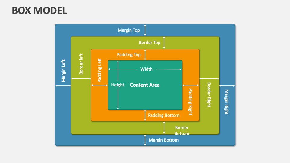
Content
ส่วนที่มีข้อมูลจริง (ตัวอักษร, รูปภาพ, ฯลฯ) กำหนดด้วย width และ height
Padding (ระยะห่างด้านใน)
ระยะห่างระหว่าง content และ border มักใช้เพื่อให้มีอากาศ ภายใน element:
/* 4 ด้าน */
padding: 20px;                   /* ทั้งสี่ด้าน 20px */

/* 2 ค่า */
padding: 10px 20px;              /* บน/ล่าง 10px, ซ้าย/ขวา 20px */
padding: 10px 20px 15px 25px;    /* บน ขวา ล่าง ซ้าย (ตามเข็มนาฬิกา) */

/* ด้านเดียว */
padding-top: 10px;
padding-right: 15px;
padding-bottom: 10px;
padding-left: 15px;
Border (กรอบ)
กรอบรอบ element ตั้งอยู่ระหว่าง padding และ margin:
/* Basic border */
border: 1px solid black;         /* width style color */
border: 2px dashed red;          /* dashed border */
border: 3px dotted blue;         /* dotted border */

/* Border style options */
border-style: solid;             /* เส้นทึบ */
border-style: dashed;            /* เส้นประ */
border-style: dotted;            /* จุด */
border-style: double;            /* เส้นคู่ */
border-style: none;              /* ไม่มี */

/* Border radius - มุมโค้ง */
border-radius: 5px;              /* มุมโค้ง 5px ทั้ง 4 มุม */
border-radius: 50%;              /* วงกลม (กว้าง/สูง = 50%) */
border-radius: 5px 10px;         /* มุมบน-ล่าง-ซ้าย 5px, มุมบน-ล่าง-ขวา 10px */

/* ด้านเดียว */
border-top: 1px solid black;
border-right: 2px solid blue;
border-bottom: 1px solid red;
border-left: 3px solid green;
Margin (ระยะห่างด้านนอก)
ระยะห่างนอก element ใช้เพื่อสร้างอากาศระหว่าง elements:
/* 4 ด้าน */
margin: 20px;                    /* ทั้งสี่ด้าน 20px */

/* 2 ค่า */
margin: 10px 20px;               /* บน/ล่าง 10px, ซ้าย/ขวา 20px */

/* 4 ค่า */
margin: 10px 15px 20px 25px;     /* บน ขวา ล่าง ซ้าย */

/* Center horizontally */
margin: 0 auto;                  /* ศูนย์บนล่าง, auto ซ้ายขวา = center */

/* ด้านเดียว */
margin-top: 20px;
margin-right: 15px;
margin-bottom: 20px;
margin-left: 15px;
Box Sizing
กำหนดว่า width และ height ใน style นั้นรวม padding/border หรือไม่:
/* content-box (default) - width = content only */
box-sizing: content-box;

/* border-box - width = content + padding + border (แนะนำ) */
box-sizing: border-box;

/* ใช้ border-box ทั่วไป */
* {
  box-sizing: border-box;
}
Box Model Example
.card {
  width: 300px;
  padding: 20px;           /* ระยะห่างใน */
  border: 2px solid #ddd;  /* กรอบ */
  border-radius: 8px;      /* มุมโค้ง */
  margin: 20px;            /* ระยะห่างนอก */
  box-sizing: border-box;  /* รวม padding ในความกว้าง */
}

/* ผลลัพธ์: */
/* Total width = 300px (width + padding + border แล้ว) */
Positioning
Position ใช้สำหรับควบคุมตำแหน่งของ element บนหน้าเว็บ มี 5 แบบที่สำคัญ: static, relative, absolute, fixed, และ sticky เลือกแบบที่เหมาะสมกับการออกแบบของคุณ
1. Static (ค่าเริ่มต้น)
Static เป็นค่าเริ่มต้นของ position ทุก element จะอยู่ในตำแหน่งตามปกติใน document flow (ไม่ขึ้นไป ลงมา ไป ซ้าย ขวา) ไม่สามารถใช้ top, bottom, left, right ได้:
/* Static position - ค่าเริ่มต้น */
.element {
  position: static;
  /* top, bottom, left, right ใช้ไม่ได้ */
}

/* ผลลัพธ์: element อยู่ที่เดิม */
/* ไม่มีการเปลี่ยนแปลงตำแหน่ง */
2. Relative (สัมพัธ์กับตำแหน่งเดิม)
Relative ย้ายตำแหน่งเทียบกับตำแหน่งเดิมของ element แต่ยังคงใช้พื้นที่ของตำแหน่งเดิม (ไม่กระทบ element อื่น):
/* Relative position - ย้ายจากตำแหน่งเดิม */
.element {
  position: relative;
  top: 20px;      /* ย้ายลง 20px */
  left: 30px;     /* ย้ายไป 30px */
}

/* ผลลัพธ์: */
/* - Element ย้ายตำแหน่ง */
/* - ยังคงใช้พื้นที่เดิม (ไม่กระทบ element อื่น) */
/* - เหมาะสำหรับปรับแต่งตำแหน่งเล็กน้อย */


/* ตัวอย่างจริง: ปรับตำแหน่ง text ไปด้านบน-ขวา */
.label {
  position: relative;
  top: -5px;      /* ขึ้น 5px */
  left: 10px;     /* ไป 10px */
}
3. Absolute (สัมพัธ์กับ parent ที่มี position)
Absolute นำ element ออกจาก normal document flow และวางตำแหน่งเทียบกับ parent ที่มี position ที่ไม่ใช่ static (ถ้าไม่มี จะเทียบกับ viewport):
/* Parent container ต้องมี position (ไม่ใช่ static) */
.container {
  position: relative; /* ต้องกำหนด */
  width: 300px;
  height: 200px;
  border: 1px solid #ccc;
}

/* Child element ใช้ absolute */
.child {
  position: absolute;
  top: 10px;      /* ห่างจากด้านบนของ parent 10px */
  left: 20px;     /* ห่างจากด้านซ้ายของ parent 20px */
  width: 100px;
}

/* ผลลัพธ์: */
/* - Element ออกจาก document flow */
/* - วางตำแหน่งเทียบกับ parent (container) */
/* - ไม่ใช้พื้นที่ของ parent (stacking order) */


/* ตัวอย่าง: Badge ที่มุมบนขวา */
.card {
  position: relative;
  width: 200px;
  border: 1px solid #ddd;
}

.badge {
  position: absolute;
  top: -5px;
  right: -5px;
  background: red;
  color: white;
  padding: 5px 10px;
  border-radius: 50%;
}
4. Fixed (สัมพัธ์กับ viewport)
Fixed วางตำแหน่งเทียบกับ viewport (หน้าจออุปกรณ์) ไม่เลื่อนไปกับการ scroll content:
/* Fixed position - ติดกับหน้าจอ */
.navbar {
  position: fixed;
  top: 0;         /* ติดด้านบน */
  left: 0;        /* ติดด้านซ้าย */
  right: 0;       /* ติดด้านขวา */
  width: 100%;
  background: white;
  box-shadow: 0 2px 5px rgba(0,0,0,0.1);
  z-index: 1000;  /* ต้องกำหนด z-index เพื่อให้อยู่บนสุด */
}

/* ป้องกันไม่ให้ navbar ทับ content */
body {
  margin-top: 60px; /* ให้พื้นที่สำหรับ navbar */
}

/* ตัวอย่าง: Fixed sidebar */
.sidebar {
  position: fixed;
  top: 0;
  left: 0;
  width: 250px;
  height: 100vh;  /* ความสูงเต็มหน้าจอ */
  background: #f0f0f0;
  overflow-y: auto;
}

/* ตัวอย่าง: Back to top button */
.back-to-top {
  position: fixed;
  bottom: 20px;
  right: 20px;
  background: #3498db;
  color: white;
  padding: 10px 15px;
  border-radius: 50%;
  cursor: pointer;
}
5. Sticky (สัมพัธ์กับ scroll container)
Sticky รวมพฤติกรรมของ relative และ fixed - ปกติเป็น relative แต่เมื่อ scroll ถึงตำแหน่งที่กำหนดจะติดเหมือน fixed:
/* Sticky position - ติดเมื่อ scroll ถึง */
.header {
  position: sticky;
  top: 0;         /* ติดด้านบนเมื่อ scroll ถึง top: 0 */
  background: white;
  border-bottom: 1px solid #ddd;
  z-index: 100;   /* ให้อยู่บนสุด */
}

/* ผลลัพธ์: */
/* - ปกติ: header อยู่ตามตำแหน่ง normal */
/* - scroll ไป: header ติดด้านบนของ viewport */
/* - ออกจาก container: header หายไปพร้อม container */


/* ตัวอย่าง: Sticky table header */
table {
  width: 100%;
}

thead {
  position: sticky;
  top: 0;
  background: #f0f0f0;
}

th {
  padding: 10px;
}


/* ตัวอย่าง: Sticky sidebar ใน 2 column layout */
.sidebar {
  position: sticky;
  top: 20px;      /* ห่างจากด้านบน 20px */
  height: fit-content;
}

.content {
  flex: 1;
}
📋 Position Values Comparison
| Position | ความหมาย | อ้างอิงกับ | ใช้เมื่อ | ตัวอย่าง |
|---|---|---|---|---|
| static | ค่าเริ่มต้น | Document flow | ไม่ต้องย้ายตำแหน่ง | ข้อความปกติ |
| relative | ย้ายจากตำแหน่งเดิม | ตำแหน่ง static เดิม | ปรับแต่งตำแหน่งเล็กน้อย | ย้ายข้อความขึ้น 5px |
| absolute | ออกจาก flow | Parent ที่มี position | วางตำแหน่งอิสระ | Badge, tooltip, dropdown |
| fixed | ติดกับหน้าจอ | Viewport | ติดที่หน้าจอ | Navbar, floating button |
| sticky | Hybrid (relative + fixed) | Parent + Viewport | ติดเมื่อ scroll ถึง | Table header, section title |
🔑 Key Properties for Positioning
/* ใช้กับ relative, absolute, fixed, sticky */

/* Top, Bottom, Left, Right */
.element {
  position: absolute;
  top: 10px;      /* ห่างจากด้านบน */
  bottom: 10px;   /* ห่างจากด้านล่าง */
  left: 20px;     /* ห่างจากด้านซ้าย */
  right: 20px;    /* ห่างจากด้านขวา */
}

/* Z-index - ควบคุมลำดับการ stack */
.overlay {
  position: absolute;
  z-index: 10;    /* ยิ่งสูง ยิ่งอยู่บนสุด */
}

/* ตัวอย่าง: Center element ที่ absolute */
.centered {
  position: absolute;
  top: 50%;
  left: 50%;
  transform: translate(-50%, -50%);
  width: 300px;
}
❌ Common Positioning Mistakes
/* ❌ ไม่ดี - parent ไม่มี position */
.container {
  width: 300px;
  /* ไม่มี position: relative; */
}

.child {
  position: absolute;
  top: 0;
  /* จะอ้างอิงกับ viewport ไม่ใช่ container */
}

/* ✅ ดี - parent มี position */
.container {
  position: relative;
  width: 300px;
}

.child {
  position: absolute;
  top: 0;
  /* อ้างอิงกับ container อย่างถูกต้อง */
}/* ❌ ไม่ดี - fixed navbar ทับเนื้อหา */
.navbar {
position: fixed;
top: 0;
width: 100%;
}
body {
/* ไม่มี padding/margin */
margin-top: 0;
}
/* ✅ ดี - เพิ่มพื้นที่สำหรับ navbar */
.navbar {
position: fixed;
top: 0;
width: 100%;
height: 60px;
}
body {
margin-top: 60px; /* ให้พื้นที่ */
}/* ❌ ไม่ดี - overflow:hidden ใน parent */
.container {
overflow: hidden;
/* sticky จะไม่ทำงาน */
}
.header {
position: sticky;
top: 0;
}
/* ✅ ดี - ไม่มี overflow */
.container {
/* ไม่มี overflow */
}
.header {
position: sticky;
top: 0;
}Display & Layout
Display property กำหนดว่า element จะแสดงผลในลักษณะใด ซึ่งส่งผลต่อการจัด layout ของเพจ
Display Values
/* Block: ยาวเต็มแนว ขึ้นบรรทัดใหม่ */
display: block;

/* Inline: ในแนวเดียวกัน ไม่ขึ้นบรรทัด */
display: inline;

/* Inline-block: เหมือน inline แต่สามารถกำหนด width/height */
display: inline-block;

/* None: ซ่อนไปไม่แสดงผล */
display: none;

/* Flex: ใช้ Flexbox layout */
display: flex;

/* Grid: ใช้ Grid layout */
display: grid;
Block vs Inline vs Inline-block
| Property | Width/Height | ขึ้นบรรทัดใหม่ | ตัวอย่าง |
|---|---|---|---|
| block | ✅ ได้ | ✅ ใช่ | <div>, <p>, <h1> |
| inline | ❌ ไม่ได้ | ❌ ไม่ | <span>, <a>, <strong> |
| inline-block | ✅ ได้ | ❌ ไม่ | <button>, <img> |
Flexbox
Flexbox (Flexible Box Layout) เป็นวิธีจัด layout ที่ยืดหยุ่นและมีประสิทธิภาพ เหมาะสำหรับการจัด element ในแนวเดียว (1 มิติ)
Container Properties
คุณสมบัติที่กำหนดให้กับ container เพื่อควบคุมการจัด items:
.container {
  display: flex;

  /* direction */
  flex-direction: row;           /* ซ้ายไปขวา (ค่าเริ่มต้น) */
                                 /* column: บนลงล่าง */

  /* wrap */
  flex-wrap: wrap;               /* ขึ้นบรรทัดใหม่เมื่อไม่พอ */

  /* content alignment */
  justify-content: space-between; /* flex-start, flex-end, center */

  /* item alignment */
  align-items: center;            /* flex-start, flex-end, stretch */

  /* ระยะห่าง */
  gap: 20px;
}
Item Properties
คุณสมบัติที่กำหนดให้กับแต่ละ item ภายใน container:
.item {
  flex: 1;              /* grow shrink basis */
  flex-grow: 1;         /* เพิ่มพื้นที่ว่าง */
  align-self: center;   /* override align-items */
}- จัด items ในแนวเดียว (แนวนอน/แนวตั้ง)
- ต้องการ responsive layout ที่ง่าย
- จัด navigation, buttons, card layouts
CSS Grid
CSS Grid เป็นระบบจัด layout ที่มีประสิทธิภาพสำหรับการจัด element แบบ 2 มิติ (แถว + คอลัมน์) เหมาะสำหรับการสร้าง layout ที่ซับซ้อน
Container Properties
กำหนดให้กับ grid container เพื่อสร้างโครงสร้าง grid:
.container {
  display: grid;

  /* กำหนด columns */
  grid-template-columns: 200px 1fr 200px;  /* 3 columns */
  grid-template-columns: repeat(3, 1fr);   /* 3 equal columns */
  grid-template-columns: repeat(auto-fit, minmax(200px, 1fr)); /* responsive */

  /* กำหนด rows */
  grid-template-rows: 100px 1fr 50px;
  grid-auto-rows: 100px;                   /* auto create rows */

  /* ระยะห่าง */
  gap: 20px;
}
Item Properties
ควบคุมตำแหน่งและขนาดของแต่ละ item:
.item {
  grid-column: 1 / 3;   /* from column 1 to 3 */
  grid-row: 1 / 3;      /* from row 1 to 3 */

  justify-self: center; /* horizontal alignment */
  align-self: center;   /* vertical alignment */
}- จัด layout ที่ซับซ้อน (2 มิติ)
- สร้าง page layout ทั้งหน้า
- ต้องการควบคุมทั้งแถวและคอลัมน์พร้อมกัน
- สร้าง dashboard, gallery, templates
Responsive Design
Responsive Design คือการออกแบบเว็บไซต์ให้ทำงานได้ดีบนอุปกรณ์ทุกขนาด (smartphone, tablet, desktop) โดยปรับปรุงขนาดและการจัด layout โดยอัตโนมัติ ถือเป็นสิ่งสำคัญในยุคปัจจุบัน เนื่องจากผู้ใช้ส่วนใหญ่เข้าเว็บจากมือถือ
Why Responsive Design Matters
- Mobile-First World - ผู้ใช้ส่วนใหญ่ (60-70%) เข้าจากมือถือ
- SEO Ranking - Google ให้ ranking ที่ดีกว่า responsive sites
- Better UX - ผู้ใช้ได้ประสบการณ์ที่เหมาะสมบนอุปกรณ์ของตัวเอง
- Cost Effective - เว็บเดียว ใช้ได้ทุกอุปกรณ์ (ไม่ต้องสร้าง app แยก)
- Future Proof - อุปกรณ์ใหม่ๆ ออกมาเรื่อย responsive design ทำให้รองรับได้เอง
Mobile-First Approach
วิธีการออกแบบที่แนะนำ - เขียน CSS สำหรับมือถือก่อน แล้วค่อยเพิ่มเติมสำหรับหน้าจอใหญ่:
เขียน CSS สำหรับมือถือก่อนแล้วเพิ่มเติมสำหรับหน้าจออื่น:
/* Base: Mobile */
.container {
  width: 100%;
  font-size: 14px;
}

/* Tablet */
@media (min-width: 768px) {
  .container {
    width: 750px;
    font-size: 16px;
  }
}

/* Desktop */
@media (min-width: 1024px) {
  .container {
    width: 960px;
    font-size: 18px;
  }
}

/* Large Desktop */
@media (min-width: 1200px) {
  .container {
    width: 1140px;
  }
}
Common Breakpoints
| Device | Screen Width | Media Query |
|---|---|---|
| Mobile (Small) | 320px - 479px | @media (max-width: 479px) |
| Mobile (Large) | 480px - 767px | @media (min-width: 480px) |
| Tablet | 768px - 1023px | @media (min-width: 768px) |
| Desktop | 1024px - 1199px | @media (min-width: 1024px) |
| Large Desktop | 1200px+ | @media (min-width: 1200px) |
Responsive Techniques
1. Flexible Widths & Fluid Layouts
ใช้ width แบบ relative (%, em, rem) แทน pixel คงที่ เพื่อให้ content ปรับตัวตามหน้าจอ:
/* ❌ ไม่ดี - ขนาดคงที่ */
.container {
  width: 1200px; /* จะเกินหน้าจอ mobile */
  margin: 0 auto;
}

/* ✅ ดี - ปรับตัวได้ */
.container {
  width: 90%; /* ปรับตามหน้าจอ */
  max-width: 1200px; /* ไม่ใหญ่เกินไป */
  margin: 0 auto;
}
2. Flexible Images
ทำให้รูปภาพปรับตัวตามขนาด container โดยไม่เกินขนาดเดิม:
/* ทำให้รูปขยายหรือหดตามขนาด container */
img {
  max-width: 100%;
  height: auto; /* รักษา aspect ratio */
  display: block; /* ลบ inline space */
}

/* ตัวอย่างอื่น - background image */
.hero {
  background-image: url('hero.jpg');
  background-size: cover;
  background-position: center;
}
3. Flexbox & Grid for Layout
ใช้ Flexbox เพื่อสร้าง layout ที่ปรับตัวได้ตามพื้นที่:
/* Flexbox - ปรับตัวตามขนาด */
.grid {
  display: flex;
  flex-wrap: wrap;
  gap: 20px;
}

.grid-item {
  flex: 1 1 250px; /* min 250px, grow if space */
  min-width: 0; /* ให้ content ปรับตัว */
}

/* Mobile: column */
@media (max-width: 768px) {
  .grid {
    flex-direction: column;
  }
}
4. Media Queries
เปลี่ยน CSS ตามขนาดหน้าจอโดยใช้ @media:
/* Mobile First - เขียน base styles สำหรับ mobile */
.card {
  font-size: 14px;
  padding: 10px;
}

/* Tablet */
@media (min-width: 768px) {
  .card {
    font-size: 16px;
    padding: 20px;
    columns: 2;
  }
}

/* Desktop */
@media (min-width: 1024px) {
  .card {
    font-size: 18px;
    columns: 3;
  }
}
5. Responsive CSS Units
/* Relative units ปรับตามขนาดหน้าจอ */
.container {
  width: 90%; /* เปอร์เซ็นต์ของ parent */
  padding: 1rem; /* สัมพัธ์กับ root font-size (16px) */
  margin: 1em; /* สัมพัธ์กับ element font-size */
  height: 100vh; /* 100% ของ viewport height */
}

/* ใช้เมื่อไร */
/* px: ขนาดแน่นอน (border, icon) */
/* %: width/height สัมพัธ์กับ parent */
/* em: padding/margin/font ที่เปลี่ยนตามองค์ประกอบ */
/* rem: padding/margin/font ที่สม่ำเสมอทั่วไซต์ */
/* vh/vw: หน้าจอขนาดใหญ่ (hero section, full screen) */
Viewport Meta Tag (Required!)
สำคัญมาก! ต้องเพิ่ม meta tag นี้ในไฟล์ HTML head เพื่อให้ responsive design ทำงานบน mobile device:
<!-- ในไฟล์ HTML head section -->
<meta name="viewport" content="width=device-width, initial-scale=1.0" />

/* attribute หมายความว่า: */
/* width=device-width: ใช้ความกว้างจริงของอุปกรณ์ */
/* initial-scale=1.0: ขยาย 100% เมื่อเปิดหน้า */
Transitions & Animations
Transitions และ Animations ใช้สำหรับสร้างการเปลี่ยนแปลงและการเคลื่อนไหว ทำให้เว็บไซต์ดูมีชีวิติและประสบการณ์ผู้ใช้ดีขึ้น ความแตกต่างคือ Transition ตอบสนองต่อ event ส่วน Animation ทำงานอัตโนมัติตามแบบที่กำหนด
Transitions - Smooth Property Changes
Transition ใช้เมื่อต้องการให้ property เปลี่ยนแปลงไป ค่อยๆ เนื้อที่ (animation) เมื่อเกิด event เช่น hover, focus, click:
Basic Transition Syntax
/* ตัวอักษร: property duration timing-function delay */
transition: background-color 0.3s ease 0s;

/* Shorthand */
transition: 0.3s ease; /* ใช้กับ ALL properties ที่เปลี่ยน */

/* Multiple properties */
transition: background-color 0.3s ease,
            transform 0.3s ease,
            box-shadow 0.3s ease;
Transition Properties Explained
| Property | ความหมาย | ตัวอย่าง |
|---|---|---|
| transition-property | Property ที่จะเปลี่ยน (ALL, color, etc.) | transition-property: background-color; |
| transition-duration | ระยะเวลา (milliseconds หรือ seconds) | transition-duration: 0.3s; /* 300ms */ |
| transition-timing-function | ลักษณะการเปลี่ยน (ease, linear, ease-in, ease-out, ease-in-out, cubic-bezier) | transition-timing-function: ease-in-out; |
| transition-delay | ความล่าช้าก่อนเริ่ม (milliseconds หรือ seconds) | transition-delay: 0.1s; |
Practical Transition Examples
/* Example 1: Button hover effect */
.button {
  background-color: #3498db;
  color: white;
  padding: 10px 20px;
  border: none;
  cursor: pointer;

  /* ทำให้ color เปลี่ยนแบบ smooth */
  transition: background-color 0.3s ease;
}

.button:hover {
  background-color: #2980b9;
}


/* Example 2: Card with multiple transitions */
.card {
  background-color: white;
  transform: scale(1);
  box-shadow: 0 2px 5px rgba(0,0,0,0.1);
  padding: 20px;

  /* ทำให้หลาย property เปลี่ยนพร้อมกัน */
  transition: background-color 0.3s ease,
              transform 0.3s ease,
              box-shadow 0.3s ease;
}

.card:hover {
  background-color: #f0f0f0;
  transform: scale(1.05); /* ขยาย 5% */
  box-shadow: 0 5px 15px rgba(0,0,0,0.3);
}


/* Example 3: Different timing functions */
.box-linear {
  transition: all 1s linear;
}

.box-ease-in {
  transition: all 1s ease-in; /* ช้าแล้วเร็วขึ้น */
}

.box-ease-out {
  transition: all 1s ease-out; /* เร็วแล้วช้าลง */
}

.box-ease-in-out {
  transition: all 1s ease-in-out; /* ช้า-เร็ว-ช้า */
}
Animations - Keyframe-based Motion
Animation ใช้สำหรับการเคลื่อนไหวที่ซับซ้อนมากขึ้น โดยกำหนด keyframes ที่อธิบายต่างๆ ของการเคลื่อนไหว:
Keyframes Syntax
/* ขั้นตอนการเคลื่อนไหว */
@keyframes slide {
  0% {     /* ตำแหน่งเริ่มต้น */
    left: 0;
    opacity: 0;
  }
  50% {    /* ตำแหน่งกลาง */
    opacity: 1;
  }
  100% {   /* ตำแหน่งสุดท้าย */
    left: 200px;
    opacity: 1;
  }
}

/* ใช้ animation */
.box {
  animation: slide 2s linear infinite;
  /* ชื่อ ระยะเวลา timing-function นำซ้ำ */
}
Animation Properties
| Property | ความหมาย | ตัวอย่าง |
|---|---|---|
| animation-name | ชื่อ @keyframes ที่จะใช้ | animation-name: slide; |
| animation-duration | นาทีที่การเคลื่อนไหวใช้เวลา | animation-duration: 2s; |
| animation-timing-function | ลักษณะการเคลื่อนไหว | animation-timing-function: ease; |
| animation-iteration-count | กี่ครั้ง (ตัวเลข หรือ infinite) | animation-iteration-count: infinite; |
| animation-delay | ความล่าช้าก่อนเริ่ม | animation-delay: 0.5s; |
| animation-direction | ทิศทาง (normal, reverse, alternate, alternate-reverse) | animation-direction: alternate; |
Practical Animation Examples
/* Example 1: Pulse effect */
@keyframes pulse {
  0%, 100% {
    transform: scale(1);
    opacity: 1;
  }
  50% {
    transform: scale(1.1);
    opacity: 0.8;
  }
}

.pulse {
  animation: pulse 1s ease-in-out infinite;
}


/* Example 2: Rotate animation */
@keyframes rotate {
  from {
    transform: rotate(0deg);
  }
  to {
    transform: rotate(360deg);
  }
}

.spinner {
  animation: rotate 2s linear infinite;
}


/* Example 3: Bounce animation */
@keyframes bounce {
  0%, 100% {
    transform: translateY(0);
  }
  50% {
    transform: translateY(-20px);
  }
}

.bouncing-ball {
  animation: bounce 0.6s ease-in-out infinite;
}


/* Example 4: Slide-in animation */
@keyframes slideInLeft {
  from {
    opacity: 0;
    transform: translateX(-100px);
  }
  to {
    opacity: 1;
    transform: translateX(0);
  }
}

.card {
  animation: slideInLeft 0.5s ease-out;
}
Transforms - Shape & Position Changes
Transform ใช้เพื่อเปลี่ยนแปลงรูปร่าง, ตำแหน่ง, มุมและขนาดของ element (อันไม่กระทบ layout อื่น) มักจะใช้ร่วมกับ Transitions หรือ Animations:
2D Transform Functions
/* Rotate - หมุน (0-360 องศา) */
transform: rotate(45deg);

/* Scale - ขยาย/หด (1 = ปกติ, 2 = ใหญ่เป็น 2 เท่า) */
transform: scale(1.5);      /* ขยายทั้งแกน X และ Y */
transform: scaleX(0.5);     /* หด ตามแนว X */
transform: scaleY(0.5);     /* หด ตามแนว Y */

/* Translate - เลื่อน (px หรือ %) */
transform: translate(20px, -10px);  /* เลื่อน X 20px, Y -10px */
transform: translateX(20px);        /* เลื่อนตามแนว X */
transform: translateY(-10px);       /* เลื่อนตามแนว Y */

/* Skew - เบนเสียว */
transform: skew(10deg, 20deg);

/* Combine multiple transforms */
transform: rotate(45deg) scale(1.5) translate(10px, 20px);
3D Transform Functions
/* 3D Rotate - หมุนในพื้นที่ 3D */
transform: rotateX(45deg);  /* หมุนรอบแกน X */
transform: rotateY(45deg);  /* หมุนรอบแกน Y */
transform: rotateZ(45deg);  /* หมุนรอบแกน Z (เหมือน 2D rotate) */

/* 3D Translate */
transform: translateZ(50px);        /* เลื่อนออกจากหน้าจอ */
transform: translate3d(10px, 20px, 50px);

/* 3D Perspective (เพื่อให้เห็นความลึก) */
.container {
  perspective: 1000px;
}

.box {
  transform: rotateY(45deg);
}
Transform with Transitions Example
/* ผสม Transform กับ Transition เพื่อสร้าง smooth effect */
.card {
  transform: scale(1) rotateY(0deg);
  transition: transform 0.3s ease;
}

.card:hover {
  transform: scale(1.1) rotateY(5deg);
}
💡 Transitions vs Animations Comparison
| ลักษณะ | Transition | Animation |
|---|---|---|
| ใช้ได้เมื่อ | ตอบสนองต่อ event (hover, focus) | ทำงานอัตโนมัติตามแบบ |
| ระยะเวลา | 0.3s - 1s (ปกติ) | 1s - หลายวินาที |
| การทำซ้ำ | ไม่ทำซ้ำ (แต่ละครั้งที่ event) | ทำซ้ำได้ (infinite) |
| Keyframes | ไม่ต้อง (2 state: from/to) | ต้องกำหนด @keyframes |
| ตัวอย่างใช้งาน | Button hover, color change, scale on hover | Loading spinner, bouncing ball, background scroll |
Best Practices & Tips
เพื่อให้ CSS ของคุณเป็นระเบียบ, มีประสิทธิภาพ, และดูแลรักษาได้ง่าย ให้ทำตามหลักการเหล่านี้:
1. Organize CSS Structure
จัดหมวดหมู่ CSS ตามลำดับเพื่อให้อ่านง่ายและหารือง่าย:
/* ===== RESET/NORMALIZE ===== */
* {
  margin: 0;
  padding: 0;
  box-sizing: border-box;
}

/* ===== CSS VARIABLES ===== */
:root {
  --primary-color: #3498db;
  --spacing-unit: 8px;
  --font-primary: Arial, sans-serif;
}

/* ===== BASE STYLES ===== */
body {
  font-family: var(--font-primary);
}

/* ===== LAYOUT COMPONENTS ===== */
.container { }

/* ===== COMPONENTS ===== */
.button { }
2. Use CSS Variables
ใช้ CSS Variables เพื่อให้ code อ่านง่าย, บำรุงรักษาง่าย, และสามารถเปลี่ยนแปลงได้ง่าย:
:root {
  --primary-color: #3498db;
  --spacing-unit: 8px;
  --font-primary: Arial, sans-serif;
}

button {
  background-color: var(--primary-color);
  padding: calc(var(--spacing-unit) * 2);
}

/* เปลี่ยนค่าตาม media query */
@media (max-width: 768px) {
  :root {
    --spacing-unit: 4px;
  }
}
3. BEM Naming Convention
BEM (Block Element Modifier) ช่วยให้ชื่อ class ชัดเจน และป้องกันความขัดแย้ง:
/* Block */
.card { }

/* Element */
.card__header { }
.card__body { }

/* Modifier */
.card--featured { }
.card--disabled { }
4. Mobile-First Approach
เขียน CSS สำหรับมือถือก่อน แล้วค่อยเพิ่มเติมสำหรับหน้าจอใหญ่:
/* Base: Mobile */
.container {
  width: 100%;
}

/* Tablet */
@media (min-width: 768px) {
  .container {
    width: 750px;
  }
}

/* Desktop */
@media (min-width: 1024px) {
  .container {
    width: 960px;
  }
}
5. Accessibility Best Practices
- Color Contrast - ทำให้ text อ่านได้ชัด (dark text on light background)
- Focus States - เพิ่ม :focus state สำหรับ keyboard navigation
- Font Size - ใช้ขนาด 16px ขึ้นไป เพื่อให้อ่านง่าย
- Line Height - ใช้ 1.5-1.8 เพื่อให้อ่านง่ายขึ้น
- Touch Targets - button/link ต้องขั้นต่ำ 44px
- ❌ Inline styles - ใช้ CSS file แทน
- ❌ pixel ทุกที่ - ใช้ relative units (rem, %)
- ❌ High specificity - เขียน selector ให้ simple
- ❌ !important abuse - ใช้ specificity ปกติแทน
- ❌ Ignoring mobile users - ทำ responsive design
✅ Summary - CSS Key Takeaways
- ✅ CSS Selectors - เข้าใจการเลือก elements ได้อย่างถูกต้อง
- ✅ Box Model - Margin, Border, Padding, Content ควบคุมพื้นที่
- ✅ Flexbox & Grid - สร้าง layout ที่ทันสมัยและเป็นระเบียบ
- ✅ Responsive Design - Mobile-first approach สำหรับทุกอุปกรณ์
- ✅ Colors & Fonts - เลือกสีและ font ที่สื่อถึงการออกแบบ
- ✅ Transitions & Animations - เพิ่มความมีชีวิตให้กับเว็บ
- ✅ Variables & Organization - ทำให้ CSS ค่อย, บำรุงรักษาง่าย
- ✅ Accessibility - ออกแบบให้ทุกคนสามารถใช้ได้
💡 Next Steps for Learning
- Practice CSS Selectors - สร้าง simple website เพื่อฝึกเลือก elements
- Master Flexbox/Grid - ทำ layout exercises บนอุปกรณ์ต่างๆ
- Learn a CSS Framework - ลอง Bootstrap, Tailwind, หรือ Material Design
- Build Responsive Websites - สร้างเว็บที่ทำงานบนทุกอุปกรณ์
- Learn SASS/SCSS - พัฒนา CSS skills ให้สูงขึ้น
- Understand Performance - เรียนรู้เกี่ยวกับ CSS performance optimization
Tools & Resources
📚 Learning Resources
| Resource | ประเภท | Link | หมายเหตุ |
|---|---|---|---|
| MDN Web Docs | Documentation | https://developer.mozilla.org/en-US/docs/Web/CSS | 📌 ที่ดีที่สุด สำหรับ CSS reference |
| CSS Tricks | Blog/Guides | https://css-tricks.com | 📌 Tutorials และ tips เชิงลึก |
| Can I Use | Browser Support | https://caniuse.com | 📌 ตรวจ feature support ในเบราว์เซอร์ |
| CSS-Tricks Flexbox Guide | Guide | https://css-tricks.com/snippets/css/a-guide-to-flexbox/ | 📌 Flexbox ที่ดีที่สุด |
| CSS-Tricks Grid Guide | Guide | https://css-tricks.com/snippets/css/complete-guide-grid/ | 📌 Grid ที่ครอบคลุม |
🛠️ Useful Tools
| Tool | ใช้สำหรับ | Link |
|---|---|---|
| Chrome DevTools | Debug CSS, inspect elements, test responsive | Built-in browser tool (F12) |
| Prettier | Format CSS code | https://prettier.io |
| PostCSS | Transform CSS with plugins | https://postcss.org |
| SASS/SCSS | Write CSS dengan variables, nesting, mixins | https://sass-lang.com |
| Tailwind CSS | Utility-first CSS framework | https://tailwindcss.com |
🎨 Color & Design Tools
- Color Picker - https://colorpicker.com (เลือกสี)
- Coolors - https://coolors.co (Color palette generator)
- WebAIM Contrast Checker - https://webaim.org/resources/contrastchecker/ (ตรวจ color contrast)
- Google Fonts - https://fonts.google.com (Free fonts)
- Font Pairing - https://www.fontpair.co (ค้นหา font combinations)
📱 Responsive Testing
- Chrome DevTools Device Emulation (F12 → Toggle device toolbar)
- Responsively App - https://responsively.app (ทดสอบ responsive บนอุปกรณ์หลายตัว)
- BrowserStack - https://www.browserstack.com (ทดสอบบนเบราว์เซอร์จริง)